The Spiral, Distressor and Blue Sugar: The Stories Behind Our Designs
Some of our designs are album art, some are just a mood. Here's where the main ones come from, so you know what you're wearing.
Where does the spiral come from?
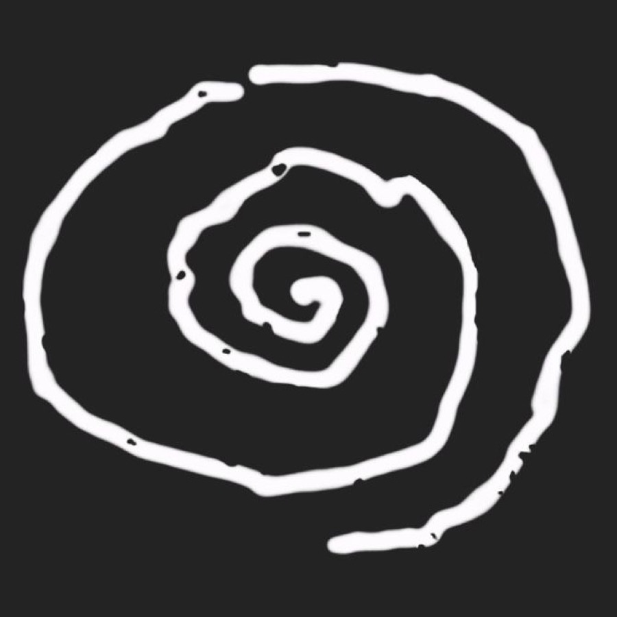
Our symbol. The hand-drawn white spiral is the mark you'll see across our merch and on our stage banner. It also turns up inside some of the bigger designs, so look closely.
What is Distressor?
Our first EP. Distressor was our debut EP, self-released. The design is stark black and white: a wall of amps, a lone figure and the spiral in the corner, under a big Whirr in serif type and the word DISTRESSOR.
Why Blue Sugar?
A song, in bright blue. "Blue Sugar" came out in 2023 with "Muta" on our own label, Free Whirl. The design stacks WHIRR and BLUE SUGAR in tall blue letters around a pile of pale blue tablets.
What does Free Whirl mean?
Our own label. Since Feels Like You in 2019 we've put our records out on Free Whirl: that album, the "Muta" / "Blue Sugar" single and Raw Blue.
The rest of the collection
Photos, words and night colours. Next to the release designs you'll find photo designs, big lyric-style type and hazy, dark artwork. They're made in the same mood as the music: blurry around the edges and best turned up loud.
Front or back?
Choose how loud you want it. Some designs sit on the front, others on the back, where a big design has room to breathe. Each product page shows where the design goes.
Find yours
Take your time, put a record on and pick the one that feels like you.